Case Study: Repose
Background: As a part of completing the Google UX certificate, I was instructed with designing a mobile-web app for finding a therapist.
Year: 2021
Role: UX, UI Designer
Tool: Figma, Google Sheets
The Research: Early qualitative-based surveys showed some common themes between users:
Cold calling and internet searching therapist offices can be a tedious and painful process. With user’s busy schedules, it can be hard to juggle finding the free time to actually go to an in-person appointment. Users expressed that a lack of information on the website or the info the receptionist can cause some problems during the process.
Persona: Mike
Age: 34 Education: Bachelor's Degree (Marketing)
Hometown: Whittier, California
Family: Married, No kids
Occupation: Advertising
Mike: “Seeing a therapist can be frustrating because of how tedious the scheduling process is.”
Goals:
Mike wants there to be a more simplistic way of actually getting scheduled with a therapist.
Frustrations:
Finds it difficult to locate a therapist that accepts his insurance and has times open for his schedule.
Cold calling a therapist's office can be tiring.
Onto some early Paper-Wireframes
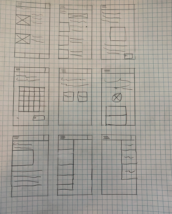
Brainstorming paper wireframes.
Next, first digital wireframes mockup.

First digital wireframe mockup. Felt a need to make the design simple and hassle free
First mock up

Through user feedback, found that formatting needed work, menu bar needed major work and added new features in final product.
Hi-fI Final Product

After some feedback from a small focus group, several new features were created.

Through user feedback, we were able to improve the user flow by enlarging certain actions, making text larger and adding small details like an easier search flow, a separate page for insurance info and a more thought-out profile button.
Moving forward
Impact:
Although this was a project in order to get a better grasp on UX. I hope that I will be able to always be improving my skills as a researcher and designer.
What I learned:
Just because I think something should be the way it is, doesn't mean it should.